AirFly
Embark on a journey to an enhanced airline experience
Overview
AirFly is a brand new airline looking to expand business by offering customers online booking and check-in systems via mobile browsers. A short-term goal is to get started and wants to focus on the MVP that users would expect to have from travel providers. Their earlier research informs the decision that the MVP should include the searching, booking, and online check-in experiences. Most importantly, the mobile web experience must function well.
TL;DR
Problem
Searching for flights can be time-consuming given the number of factors involved - like price, layover, flight times, leg room, and meal services. Booking a flight also requires copious amounts of details. This complicates the user journey, so simplicity in design is going to be very important.
Proposed Solutions
Advanced flexible search: The key goal of this feature would be to allow flexible travelers to find the best flights. The usual filters, like the number of stops, baggage, airlines, leg room, price, and duration provide service to filter flights that the user finds convenient or acceptable, another filter is missing. Time.
Bookmark frequent flying flights: The goal of this feature is to provide a convenient way of storing flights for users so that users will not need to memorize them.
Such selected flights will always be shown at the top if they fit within the search criteria.
Project Type
Capstone project
Category: Responsive Website design for mobile browser
Role
UX Researcher
UX Designer
UI Designer
Visual Designer
Goal
A new airline looking to expand business by offering customers online booking and check-in systems (MVP) via mobile browsers.
Timeline
3 week of research
4 weeks of design and handover of documents
Deliverables
User interviews
Competitive analysis
Personas
User journeys and task flows
Low-fidelity wireframes
High-fidelity mockups and prototypes
Design system and UI kit
Usability tests and findings
Discover
Problem Statement
The airline industry faces a lot of competition. Most airlines are only slightly different from their counterparts. In such an environment, having parity with competition is important while achieving some form of uniqueness for new or smaller airlines.
Searching for flights can be time-consuming given the number of factors involved - like price, layover, flight times, leg room, and meal services. Booking a flight also requires copious amounts of details. This complicates the user journey, so simplicity in design is going to be very important.
Goal
Identify the typical user journey, from flight search to booking, check-in, boarding, and post-trip activities. Understand user needs, behaviors, pain points, and opportunities for improvement at each stage
Identify user behaviors during flight search and booking workflow and improve the user experience around it
Improve Baggage and Check-in Process
Determine the key motivations for using the airline app and the primary tasks users want to accomplish
Evaluate the usability of the flight search and booking process to identify pain points and areas for improvement.
Identify any barriers or confusion in the booking flow and propose solutions to streamline it.
Investigate users' behavior and needs in the app's payment process
User Interview
I interviewed 5 people from various demographics and backgrounds. All who I knew were frequent flyers who fly at least 2-4 times a year. Each interview averaged about 40 minutes and the most important questions I asked were open-ended. I heard their responses and dived deep within their feelings to really pain point out user frustrations.
Talking to people about their user journey was eye-opening for me. Most people, when not flying for business or work, prefer to find the best deal on their flights while assuming a bit of inconvenience.
40% of interviewees said that they try to find a flight and then change dates to see if they can find a better deal.
40% of other interviewees said that they would change the flight dates a few days here and there if they get more convenient flights. Essentially, for personal travel, most interviewees were looking for more flexibility in booking in terms of dates.
Holiday bookings are also very different. 60% of interviewees said that they don’t care about specific dates, but they care about certain date ranges. E.g. Napa Valley vineyard vacation needs to happen this summer or a long vacation to some exotic place can happen any time around the end of the year to the beginning of the year.
For check-in workflow, interviewees are tired of having to find a trip confirmation number from the email and copy it to the check-in form. 80% of interviewees found this irritating.
Empathy mapping
To synthesize the qualitative data gathered from user interviews, I created an empathy map to identify patterns across users, uncover insights, and generate needs.
User Needs
Efficient Booking Process: Users need a straightforward and time-saving flight booking process with intuitive navigation and clear steps.
Real-Time Flight Information: Users want instant access to accurate and up-to-date flight status, gate changes, and delays.
Personalization: Users seek personalized travel experiences, such as seat preferences, meal choices, and loyalty program benefits.
Multiple Payment Options: Users need diverse payment methods to cater to their preferences and ensure a smooth transaction.
Easy Check-In and Boarding: Users desire hassle-free check-in and boarding procedures, ideally accessible through the app.
User Motivations
Convenience: Users are motivated by the ease and convenience of booking flights and managing travel plans on the go.
Best Deals: Users seek cost-effective flight options and discounts to save money and get the best value for their travel.
Time Savings: Users are motivated to use airline apps to save time and effort in the booking and check-in processes.
Loyalty Rewards: Users are incentivized by loyalty programs that offer exclusive benefits, upgrades, and rewards.
User Frustration
Complex Booking Flows: Users are frustrated by confusing booking processes, especially when dealing with multi-city trips, flexible date searches, number of passenger change.
Hidden Fees and Charges: Users are disappointed when additional fees or charges are not transparently displayed during booking.
Limited Customer Support: Users feel frustrated when faced with limited customer support options, especially during travel disruptions.
Inconsistent Experience: Users are disappointed when the app's user experience varies across different devices or platforms.
Competitive analysis
I took 4 of the US airlines - Delta, American Airlines, United Airlines and JetBlue - and did a competitive analysis against their feature set.
Why those 4?
Because while Delta and United Airlines focus more on business travelers, AA and JetBlue are more focused on leisure travel. JetBlue is a low-cost carrier. So combined this set provides a mix of different worlds.
On the flight search side, while most airlines provide advanced search features, Delta, AA, and JetBlue provide data grids as well while UA doesn’t.
most airline’s UX is very similar suggesting that there exists an industry standard. We can’t diverge a lot from that standard or reinvent the wheel here as it would add additional user education costs or risk generating more user frustration.
Define
POV Statements
To create the design focus and empathize with users, I created the following POV statements grounded in real user insights
Efficient Search Customization: I would like to investigate ways to enable frequent travelers to customize searches without returning to the main screen. Streamlining the process eliminates repetition and memorization.
Empowering Frequent Travelers: I would like to explore solutions to save selected flights for frequent travelers. Avoiding starting from scratch reduces frustration and simplifies the booking process.
Tailored Flight Suggestions: I would like to examine options to offer personalized flight suggestions based on previous purchases for frequent travelers. Comparing flights effortlessly enhances task completion.
Optimizing Deals for Flexible Travelers: I would like to discover methods to provide flight options for flexible future travel, helping travelers book flights faster by finding better deals.
HMW Questions
Once I had my POV statements that helped me reduce biases, I converted to HMW statements, hoping that it would help me align my priorities and narrow down problem space.
Efficient Search Customization:
HMW help flexible travelers to find flights for the future?
HMW help flexible travelers provide the best deal for comparison?
HMW simplify the search customization to eliminate the need for users to memorize the information during the booking process?
Empowering Frequent Travelers:
HMW make it easier for frequent travelers to save selected flights for later booking?
HMW streamline the process for resuming bookings without starting from scratch, reducing frustration for frequent travelers?
Tailored Flight Suggestions:
HMW provide better flight suggestions based on frequent travelers' previous purchases, helping them compare options without memorizing past details?
HMW personalize flight options for frequent travelers to ease decision-making and enhance their overall booking experience?
Optimizing Deals for Flexible Travelers:
HMW offer flight options tailored to the flexible future travel needs of users, assisting them in finding better deals quickly?
HMW enhance the app's ability to present relevant flight deals for flexible travelers, reducing the time it takes to book flights?
Persona
Using my research, I was able to create the perfect persona of my ideal user. I can see the narrowing of what problem I want to solve.
Develop
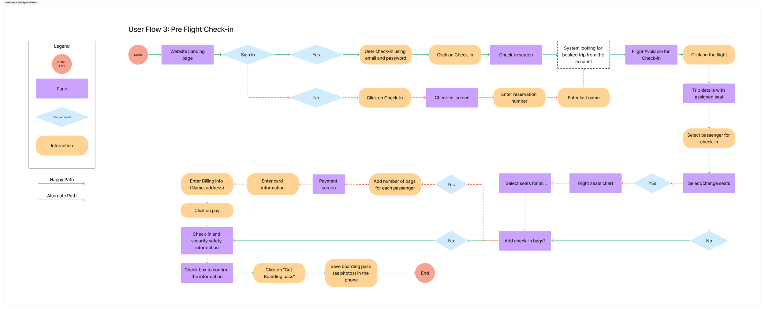
User Flow
It was important to keep the user and task flow consistent with industry standards, but also incorporate features that I wanted to add to it. The main feature that needs to be added is flexible advanced search.
I decided to do a default search to be what the industry standard is, Standard search is based on day destination, and specific days of flights with a standard filter. If users want to do a flexible search, an easy action button will route them there.
Bookmark frequent flying flights
The goal of this feature is to provide a convenient way of storing flights for users so that users will not need to memorize it.
Such selected flights will always be shown at the top if they fit within the search criteria.
Low Fidelity Wireframes
The main challenge of designing this feature was to design the “flexible search” feature where we would allow date ranges for departing and returning flights. I tinkered around few ideas, like
Providing range for both of those dates, but then realized that this might be too many selections users would have to do to find flights
Providing flexible dates one way and asking for a number of days with variations around it. Though I was worried that it might cause confusion on the users’ side as it deviates significantly from the industry standard as it does not ask for the return flight dates
Ask for both departing and returning flights and also ask for flexibility around those dates by asking for acceptable day variance. This seems to be the simplest design that meets industry standards, so I decided to go with it.
Mid fidelity Wireframes
UI Kit
Color: I initially chose the muted color and tried it in wireframe but it did not feel energetic and exciting. since this is the product that most people use for vacation and business, I wanted to make it feel encouraging, relaxing, energizing, rejuvenating, Trustworthy, warm, and also Professional at the same time.
Typography: I choose Open Sans for its neutral yet friendly appearance. most importantly it is also easily readable in small sizes, which I require because of a lot of content
Idea Generation
Using my research to understand user needs, it was clear that there are 3 key features that users need for an airline app and HAS to be integrated in the MVP.
Search for flights
Booking flight
Check-in
Above are the top priorities for MVP. But, our research revealed 2 other sub-problems as well that users seem to be facing that can be solved.
Advanced flexible search
The key goal of this feature would be to allow flexible travelers to find the best flights. The usual filters, like the number of stops, baggage, airlines, leg room, price, and duration provides service to filter flights that the user finds convenient or acceptable, another filter is missing. Time.
This feature will allow users to do flexible searches on time as well.
Sitemap
Now that I have the information I need, I started with a sitemap. Home page points to the main functionality which is search for the flight and then leads to other functionalities
Feature Roadmap
Equipped with the above idea, I created a detailed roadmap with a prioritized list of features. While there are a lot of MUST HAVEs in this list, below is the set of features that I took for MVP.
TaskFlow
Using the same tool, I created a task flow for the main functions the app should have. This task flow includes the most common type of app usage where a user will come to the HandyDandy app to book a home maintenance task appointment.
Deliver
High fidelity wireframes
Once I had good mid-fidelity wireframes that I trusted to be simple and logically flowing, I added colors and started making testable wireframes. Here are some updated versions
Measuring success
We can measure the success of this project with the following criterias
Percentage of times users used flexible search
Amount of time (in seconds) users took from beginning the flight search to flight summary page
Amount of time (in seconds) users took from flight summary to flight completion of booking flight with payment
Amount of time (in seconds) users took from beginning of check-in process to obtaining the boarding pass
Usability testing
Now it’s time to see if people find my design as logical as I found myself. So I created the following tasks in Maze using my designs
Search and book best priced return flight tickets from Miami to Las Vegas for next to next weekend
Assume that you are traveling tomorrow, perform the online check-in workflow
Not only that, I wanted to see if people find the “flexible search” feature helpful or not. So I created a Maze test session and added the following tasks
Imagine you are booking flights from Seattle to Chicago to travel and meet with family around Christmas. You are flexible on dates, but the price is an issue. Book best-priced flights.
Here are the results from the usability testing.
All users were able to perform all 3 tasks successfully
All users found the check-in workflow very easy and intuitive to follow
All users found booking process consistent with what they have seen on other airlines website
80% of the users immediately jumped on flexible search for last task
Latest Wireframes
After performing usability testing, we didn’t have much to work on. 90% of the users were able to perform task and provided positive feedback. some of the users found text in some places little small, which was increased in the some of the wireframes
Preferred flight
Based on our UX study, Frequent fliers (corporate or personal) always look for one type of flights over the others. E.g. corporate fliers fly in the morning earlier in the week and evening late in the week. I added an ability to mark a flight as favorite or preferred to track their preferences and suggest such or similar flights in future
Add/remove passenger at any point before payment
60% of our users reported that they search for flights for only one passenger and then add a passenger later. we heard them and decided to give them flexibility and added a feature to provide them feature where they can add/change passenger up until payment. If the tickets are not available for number of passenger and price changes will show up in a pop up.
Next Steps…
With the MVP out which includes all the necessary features for an airline, lots of future plans can be added on it based on interviews that we conducted, but we couldn’t add to the MVP. Below are just a few to name
Show all the bookings from past and current
Ability to store travelers’ information and necessary documents for travelers
Save user’s flight preferences to surface such flights above others
Add a frequent flyer program and features that come with it, e.g. incurred miles and other perks